
Introduction
This article is a simple approach for achieving reusable AutoComplete user control.
Skeleton of the XAML
1 2 3 4 5 6 7 8 9 10 11 12 13 14 15 16 17 18 19 20 21 22 23 24 25 26 27 28 29 30 31 32 33 34 35 36 37 38 39 40 41 42 43 44 45 46 47 48 49 50 51 52 53 54 55 56 57 58 59 60 61 62 63 64 65 66 67 68 69 70 71 72 73 74 75 76 77 78 79 80 | <UserControl x:Class="AutocompleteTextbox.AutoCompliteTxtBox" xmlns="http://schemas.microsoft.com/winfx/2006/xaml/presentation" xmlns:x="http://schemas.microsoft.com/winfx/2006/xaml" xmlns:mc="http://schemas.openxmlformats.org/markup-compatibility/2006" xmlns:d="http://schemas.microsoft.com/expression/blend/2008" Height="Auto" Width="Auto" Padding="0" x:Name="uc" Background="Transparent" Loaded="UserControl_Loaded"> <StackPanel> <TextBox Grid.Column="0" Grid.Row="0" Name="textBox1" Width="{Binding ElementName=uc,Path=Width}" Height="{Binding ElementName=uc,Path=Height}" Margin="{Binding ElementName=uc,Path=Margin}" Padding="{Binding ElementName=uc,Path=Padding}" IsEnabled="{Binding ElementName=uc,Path=IsEnabled}" IsReadOnly="{Binding ElementName=uc,Path=IsReadOnly}" HorizontalAlignment="{Binding ElementName=uc,Path=HorizontalAlignment}" VerticalAlignment="{Binding ElementName=uc,Path=VerticalAlignment}" TextChanged="textBox1_TextChanged"/> <Popup Name="myPopup" PlacementTarget="{Binding ElementName=textBox1}" MinWidth="{Binding ElementName=textBox1,Path=Width}" MinHeight="150" MaxHeight="500" AllowsTransparency="True" Focusable="True" StaysOpen="True" PopupAnimation="Slide" Placement="Bottom"> <Popup.Style> <Style TargetType="{x:Type Popup}"> <Style.Triggers> <MultiDataTrigger> <MultiDataTrigger.Conditions> <Condition Binding="{Binding ElementName=textBox1, Path=IsFocused}" Value="True" /> <Condition Binding="{Binding ElementName=listBox1, Path=HasItems}" Value="true" /> </MultiDataTrigger.Conditions> <MultiDataTrigger.Setters> <Setter Property="IsOpen" Value="True" /> <Setter Property="StaysOpen" Value="True" /> </MultiDataTrigger.Setters> </MultiDataTrigger> <DataTrigger Binding="{Binding ElementName=textBox1, Path=IsFocused}" Value="False"> <Setter Property="IsOpen" Value="False" /> <Setter Property="StaysOpen" Value="False" /> </DataTrigger> <DataTrigger Binding="{Binding ElementName=textBox1, Path=Text.Length}" Value="0"> <Setter Property="IsOpen" Value="False" /> <Setter Property="StaysOpen" Value="False" /> </DataTrigger> </Style.Triggers> </Style> </Popup.Style> <ListBox Name="listBox1" MinHeight="100" Background="LightYellow" HorizontalAlignment="Stretch" SelectionMode="Single" ScrollViewer.HorizontalScrollBarVisibility="Hidden" SelectionChanged="listBox1_SelectionChanged"/> </Popup> </StackPanel> </UserControl> |
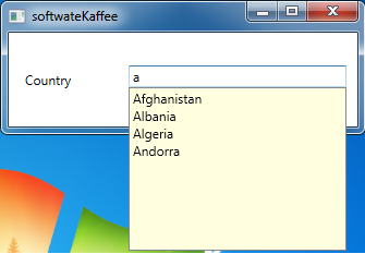
Expected Output
External Resources
No comments:
Post a Comment